
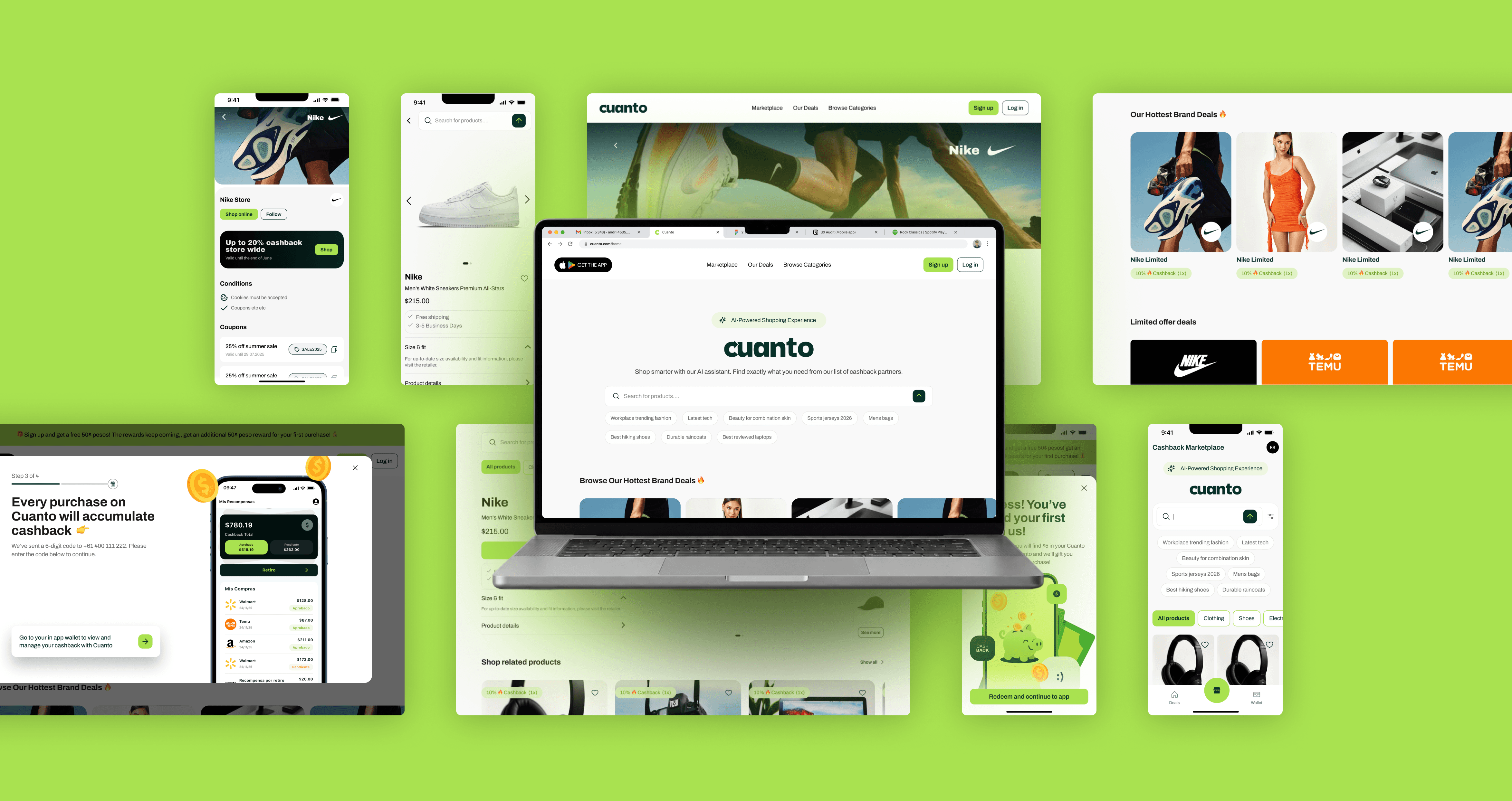
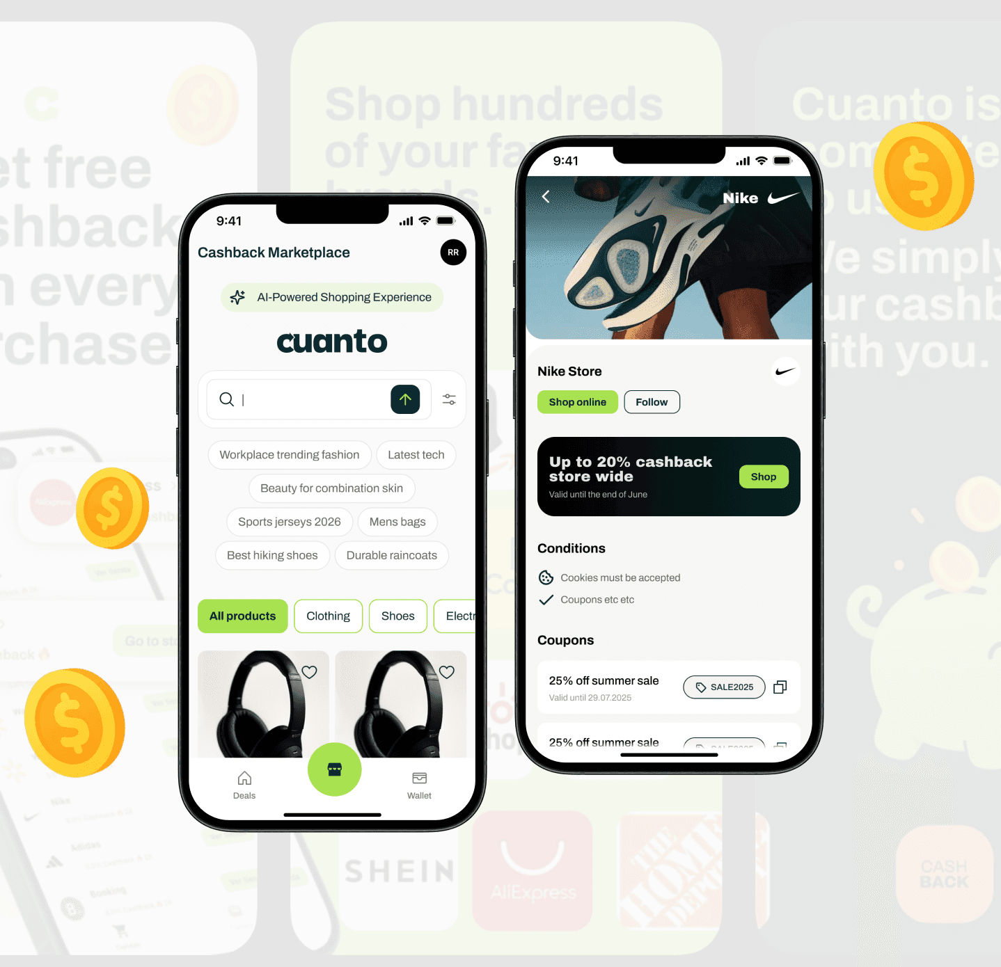
Mobile App Screens / States
Core flows, onboarding, states & interactions
Responsive Web Screens / States
Marketplace, account management & cashback flows
0 → MVP design delivery
Research, branding, UX, UI, launch assets and marketing.
Core cashback and discovery experience designed to maximise engagement, retention, and repeat purchases.
Marketplace and onboarding web platform built to to streamline acquisition and conversion across devices.
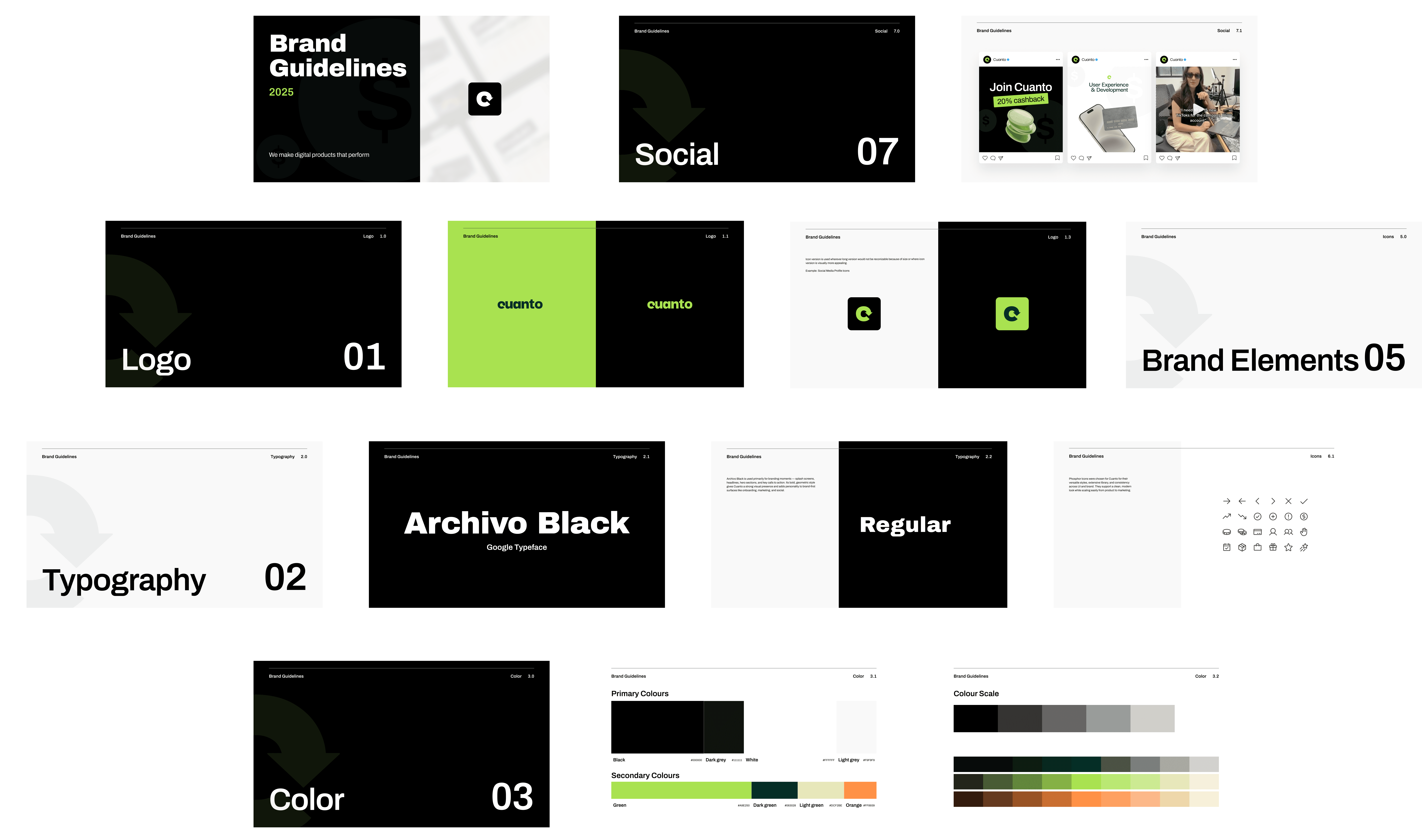
Modern visual system designed to position Cuanto as a trusted, scalable consumer tech product.
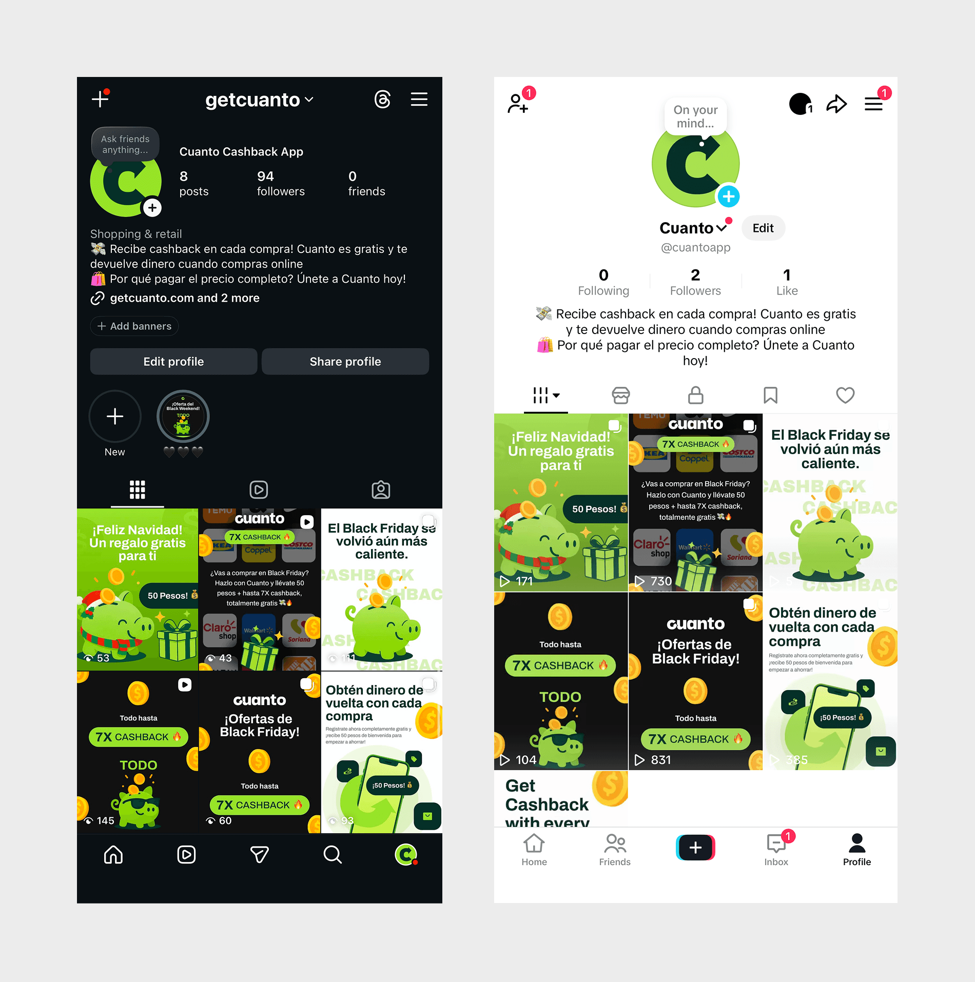
Conversion-focused marketing assets created to support rollout, visibility, and user growth.
Design Thinking
Independent Thinking, Collaborative Execution. How we got results.
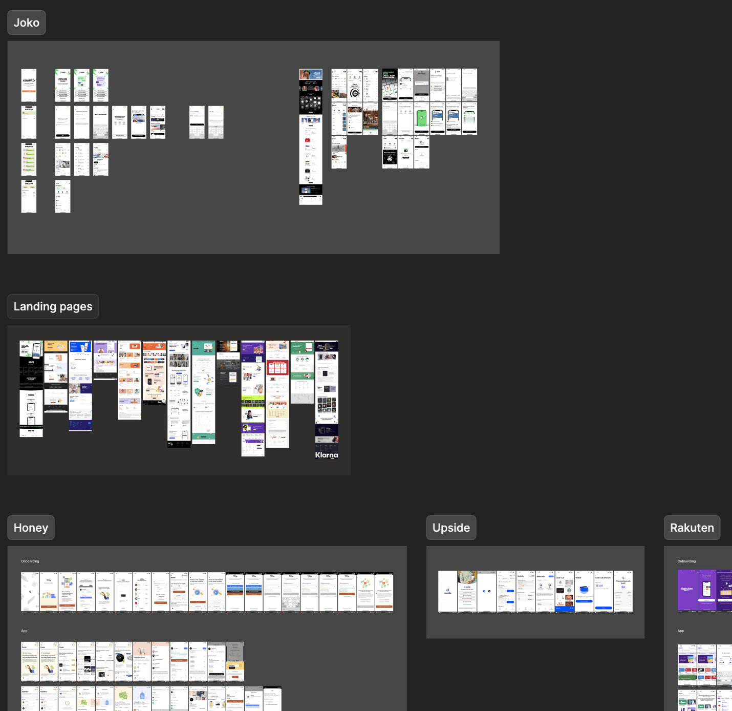
After researching and benchmarking both cashback platforms and emerging AI shopping assistants, I realised there was a much larger product opportunity than simply building another rewards app in a saturated market.
Most competitors focused purely on cashback after the shopping experience, while newer AI commerce products focused on helping users discover products more intelligently. I saw an opportunity for Cuanto to combine both models into a single experience, helping users first discover the best matching products online, then rewarding them through cashback incentives.

Market research helped uncover a stronger product opportunity that competitors were not yet combining. We would be unique.
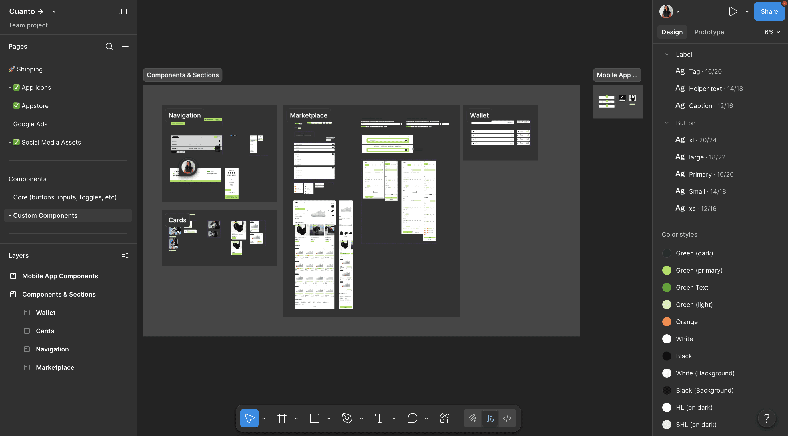
Together with the CTO, I developed a scalable design system that allowed us to move quickly without building everything completely from scratch.
Rather than designing isolated screens, I focused on creating reusable foundations that could scale across devices, speed up implementation, and maintain consistency as the product evolved.
By building a Figma system, we were able to move rapidly across 100+ screens / states without sacrificing usability or consistency.
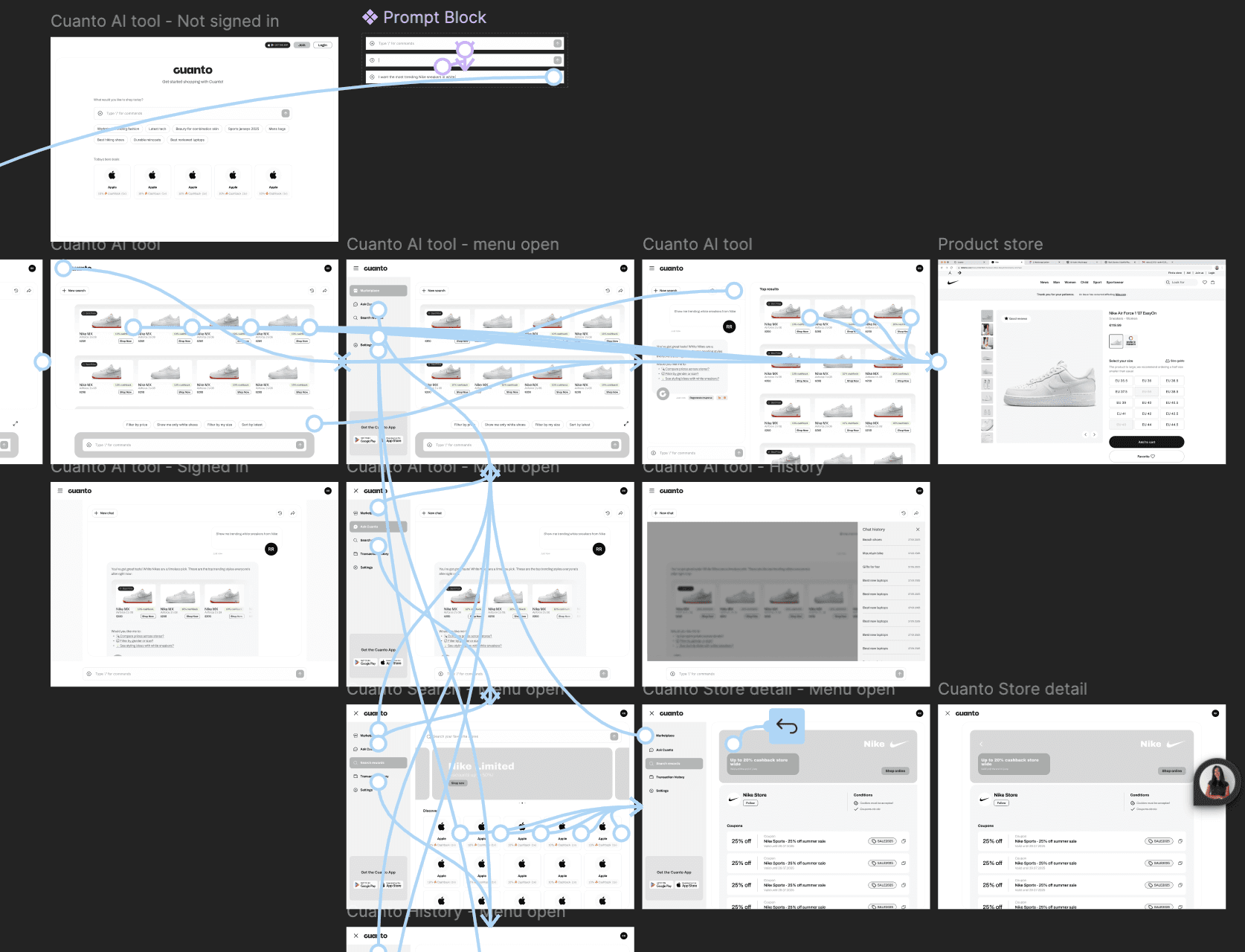
To speed up iteration, I started with wireframes and flows before high fidelity UI. This helped us validate the AI shopping assistant model quickly, reduce unnecessary redesigns later, and confidently move into development and investor demos.
For example, since we were offering a new type of shopping experience, our onboarding strategy was critical to get right.
I explored three onboarding strategies: 1. a personalised onboarding, 2. AI guided walkthrough, and 3. an interactive product simulation.
I determined that between the flow and conversion statistics, the interactive journey would give users the clearest understanding.
Mapping flows, wireframes, and prototypes for this new product helped validate the direction and avoide complex iterations.
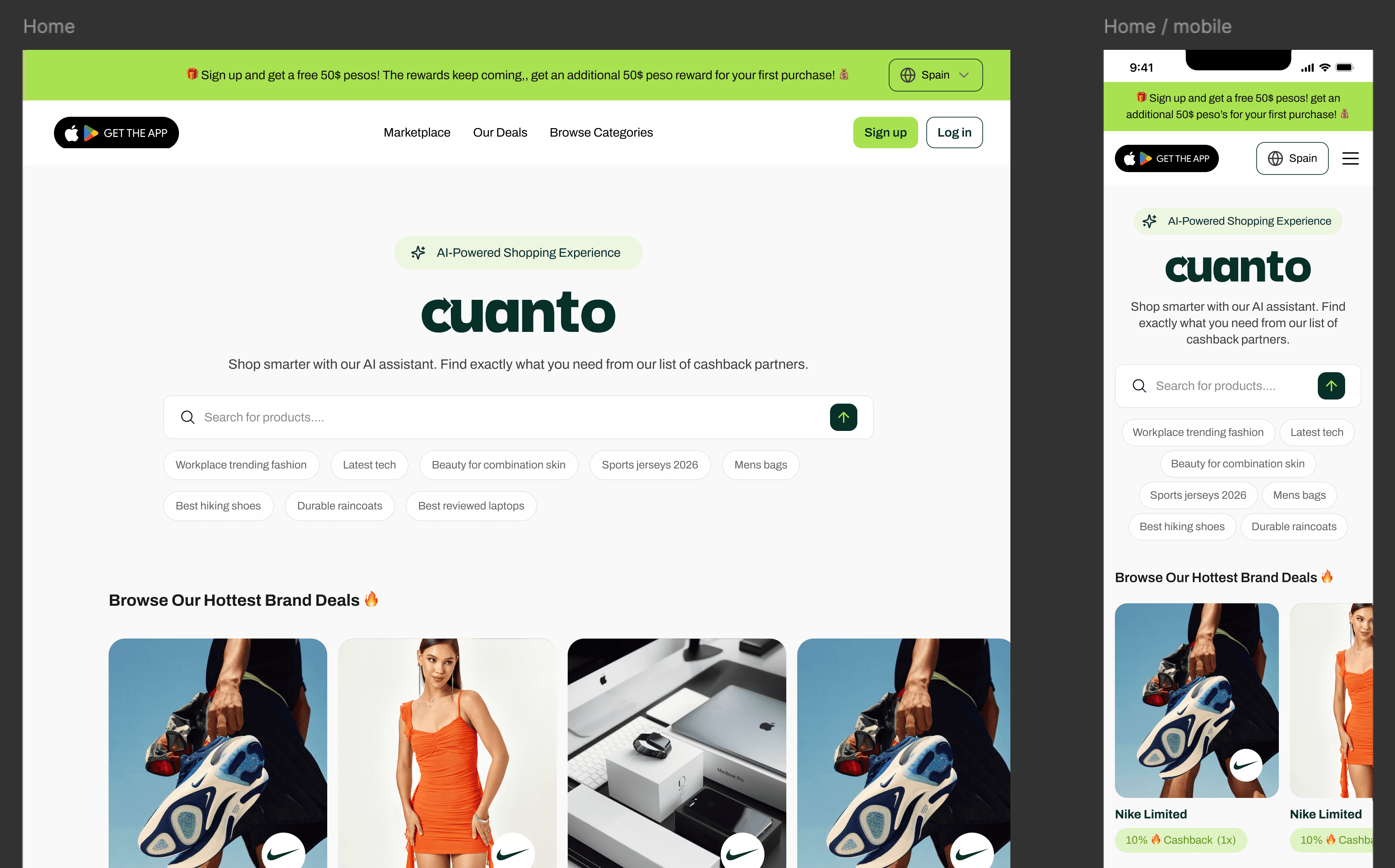
I identified early that users needed to experience the product value immediately, not just read about it. By placing the AI powered shopping search directly in the hero section, users could instantly interact with the product before committing to sign up.
Since this was a new type of shopping experience, I focused heavily on making the product feel familiar from the beginning. Using recognisable UI patterns, trusted partner brands, and layered product information helped reduce friction, build trust quickly, and encourage stronger long term engagement and retention.
Everything users needed to make a decision was within the first glance of the site. The hero alone made users want, understand, trust, and start using the product immediately.
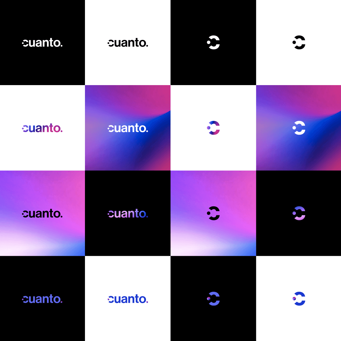
Cuanto already had its logo and primary colours established, however I developed the wider brand foundations including typography, sizing systems, UI rules, iconography, and custom illustrations to help the product feel more engaging, recognisable, and trustworthy for B2C users.
One major issue I identified was that the arrow within the type logo caused the name to read as “Guanto” rather than “Cuanto”. While subtle, this is the kind of flaw that can affect brand recognition and searchability online, so I adjusted the logo without needing a full redesign.
Simple design fixes improved recognition & searchability, while strong UI rules made us instantly more trustworthy as a new brand.
Initially, the direction leaned heavily into a more technical AI aesthetic. Through iterations, I pushed the experience toward something cleaner and more approachable, as we were ultimately targeting everyday non technical users.
I used familiar UI patterns, strong visual hierarchy, and reduced visual noise to make the experience feel intuitive immediately, while naturally guiding users toward product discovery and purchase actions.
I delivered quality, strategically engineered screens using our new Figma system & components for seamless implementation.
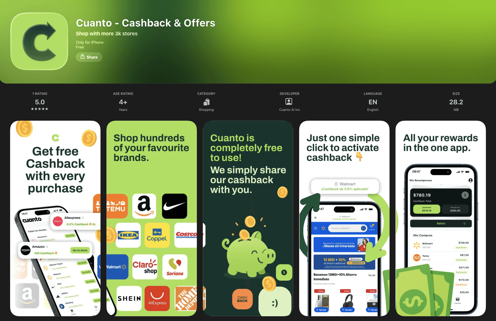
The product experience did not stop once the screens were finalised. A huge part of building a successful startup product is then getting those designs seen, understood, and trusted by users.
I designed the App Store visuals, social media content, and launch assets to communicate the product value within seconds. Strong branding, recognisable visuals, and custom illustrations helped the product stand out quickly, while also building trust and credibility with younger online shoppers.
The psychology behind making users stop, pay attention, and decide to download is often invisible within good design.
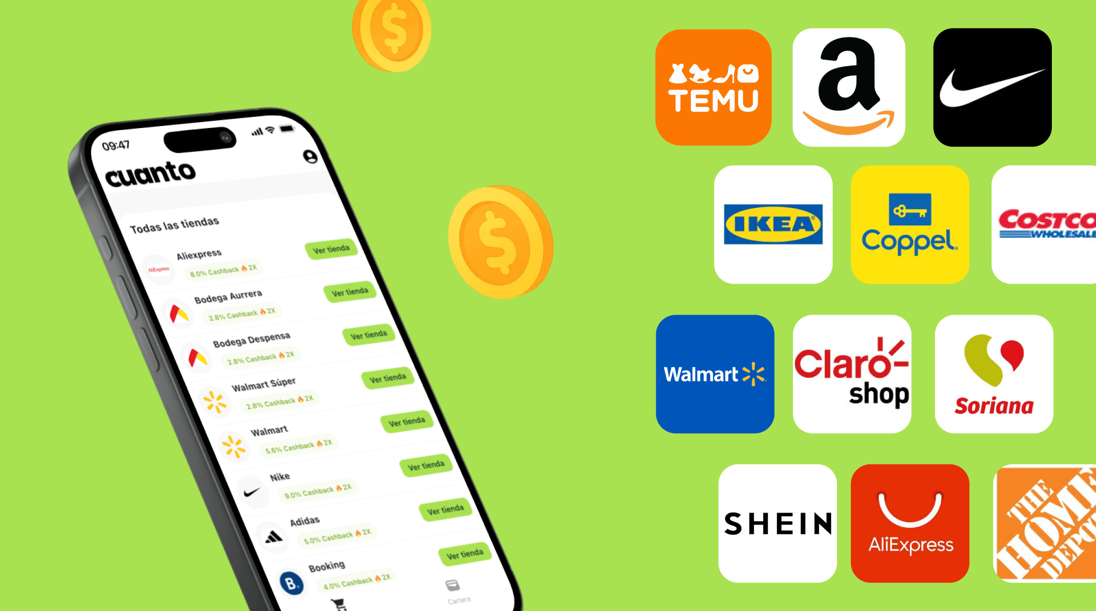
Following launch, within 6 months the platform reached 20,000 installs, 10,000 active users, 40% retention, over 21,000 partner brands including Nike, Walmart, Adidas, and SHEIN, and processed over $1M in GMV monthly.
I’m incredibly proud of how the product turned out, and grateful to have worked alongside such a strong team throughout the process. Together, myself, the CEO, and the CTO, were able to take the product from an idea to a product with real traction and measurable impact.
20,000 installs, 10,000 active users, 50% retention, over 21,000 partner brands and over $1M in GMV processed monthly.
Next Steps
In true startup style,
the product is still evolving.
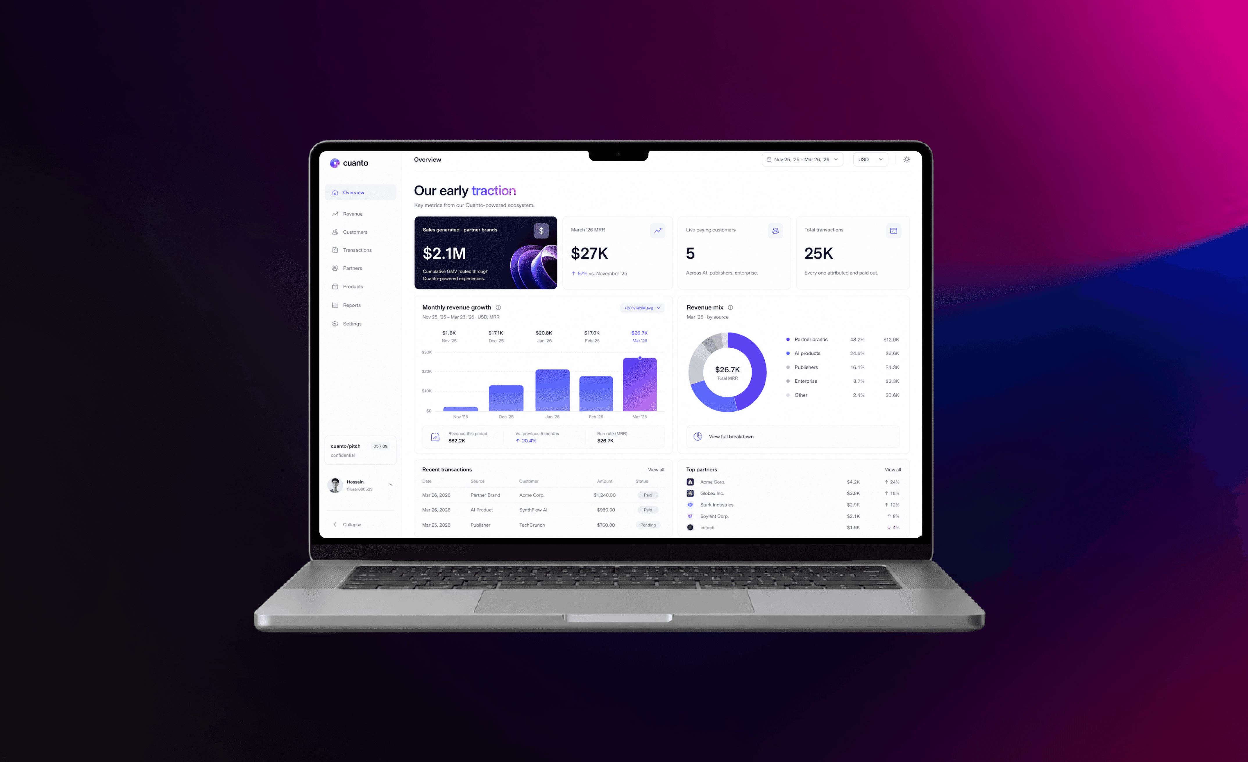
Work
Every startup is different,
see what else i've helped shape.
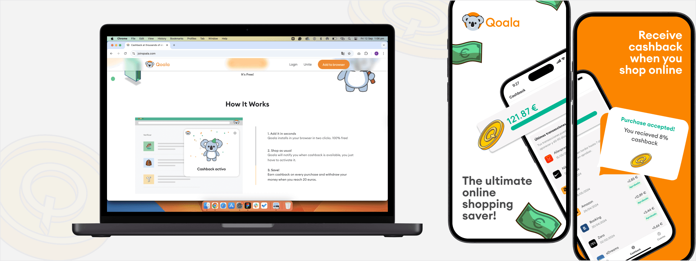

B2B2C E-Commerce Extension & App

AI Agent Platform & Marketplace
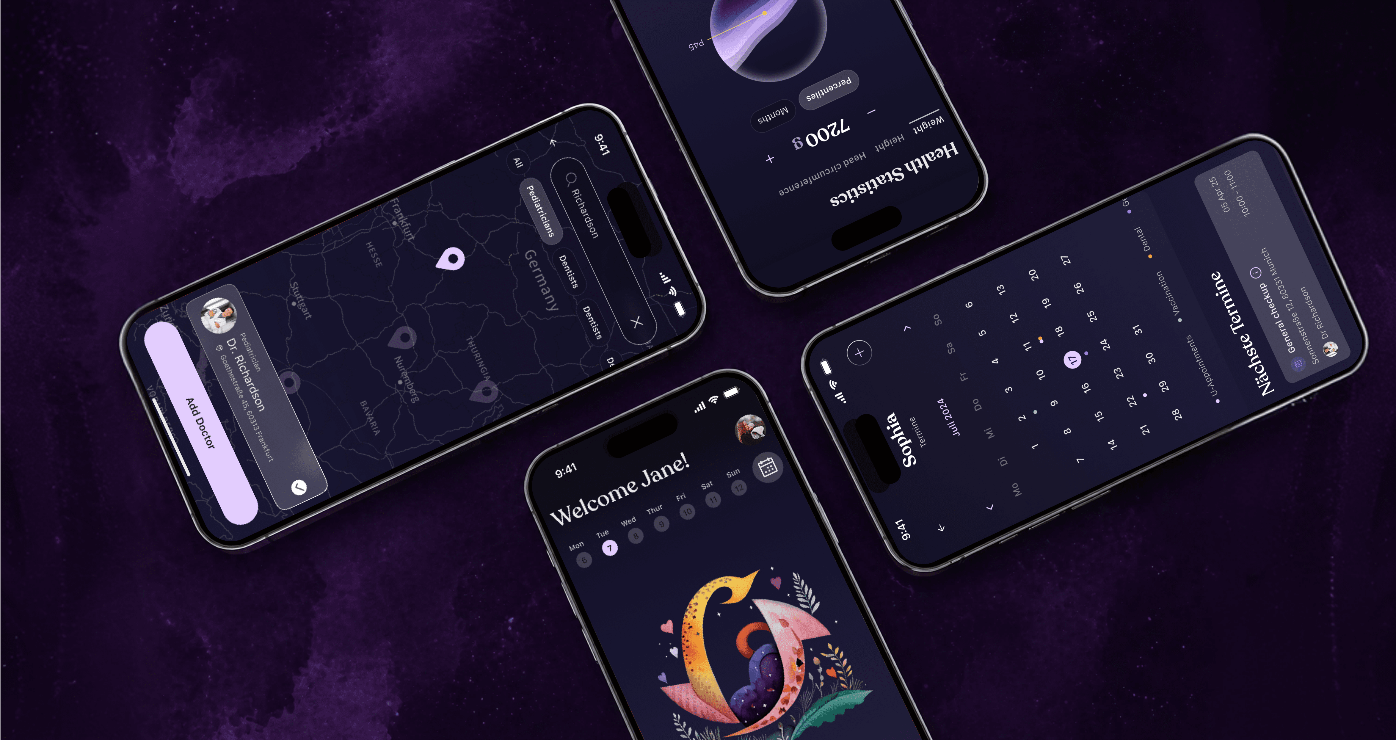


Child Health AI Tracking Mobile App